I’ve started doing covers for my own releases, and thought it would be fun to share a bit of the process with you – in this case, for my trans-elf San Francisco climate change story Cailleadhama.
The first step (and often one of the most time-intensive ones) is to find an image that suits the story. In this case, I was looking for something to represent a partially drowned city of San Francisco, along with a seawall to hold back the waters. Bonus points for a gondolier…
After a bit of searching, I found this image, which I immediately loved:
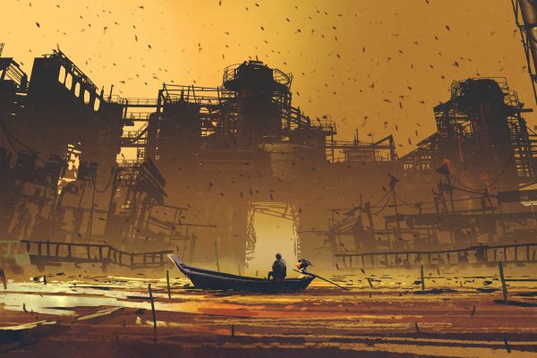
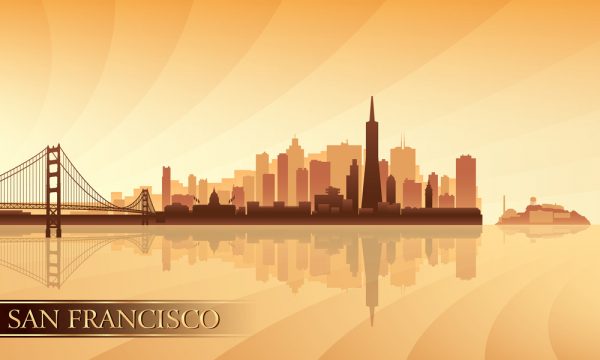
Couple problems. First, it’s not recognizably San Francisco. So I found this nice SF illustration with the iconic SF Transamerica “pyramid” to use as the background, with a little blurring:
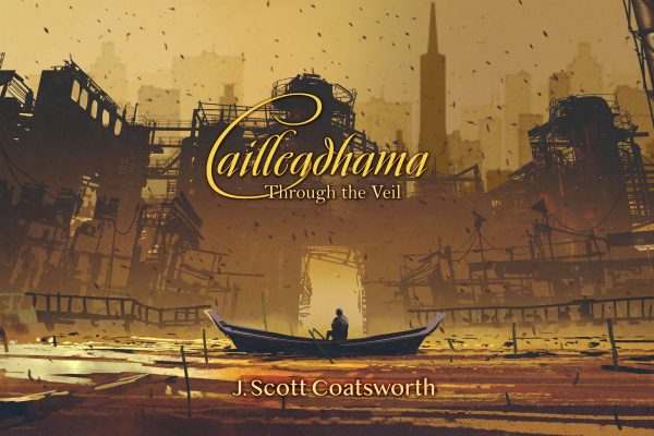
Also, that’s clearly a motorboat, *not* a gondola. And it needs some oars, and the guy’s a little chunkier than my protagonist. So I copied the front half of the boat, flipped it around, modified it a bit so it wasn’t a mirror image, added some oars, and gave the guy a little nip and tuck. Oh, and some words, please:
Next problem… I don’t have enough image on the left for the back page of my book cover. And I want to brighten up the intensity of the image. Oh, and that title font is really hard to read, especially in small “thumbnail” size. So…
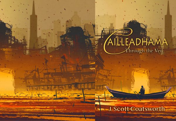
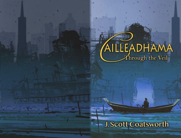
Now le’s smooth things out a little, darken the back cover, and make the two match. Oh and since I just realized this is the same color palette as my last indie release “The Last Run,” let’s shift it over to blue. Better suits the story anyhow:
Now for the final touches. Spine text. Author photo and logo. Headline and blurb on the back. And a gradient to make the back a little more interesting:
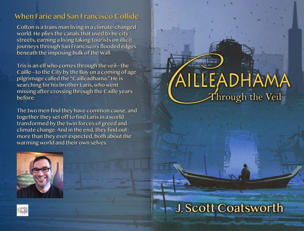
And we’re done!
Technically the Transamerica building is on there twice, but no one is likely to notice.
I really enjoy doing graphics work like this. It feeds a whole different part of me. But it’s also very time consuming LOL and I admit I still have a lot to learn. But it’s fun to do, and even more fun to share.
Writers, do you do your own covers? If so, any tips or ticks you wanna share?