
Last Saturday, I released a new short story. Well, both new and old, as it was originally written in the 90’s and never published until Galaxy’s Edge picked it up recently.
Even though this is a 99¢ short story, I still wanted a cool cover for it. The one I ended up making reminds me of the 80’s mass market fantasy covers I loved so much in High School.
So I thought it would be fun to show you how it was done.
The longest part of the whole cover creation process is finding the right image or images. In this case, I searched under lamp and lantern and dove down five or six Deposit Photos rabbit holes at once. I use the “Similar Images” search a lot when I find something that’s close, and it finally led me to this one:
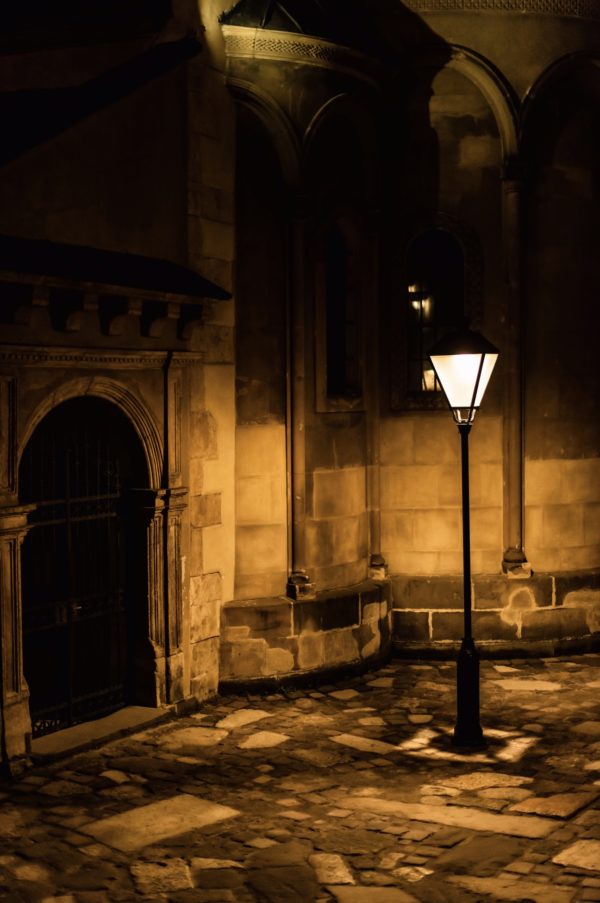
I loved the feel of it. The stone walls, the cobblestone feel of the streets, and the simple lantern all fit the vision I have of Thyre, the city where the story takes place. I added a little lantern flame and played around with the title:

Better. Still, the thing was a bit too sepia-tone/old timey feeling for what I wanted. So… new fonts and a radical color shift, which really made the lantern pop:

I loved where it was going. But things were a bit… empty feeling. So how about another lamp? I copied the first one and pasted it in larger/closer, played a bit with the title font (I fidget constantly with fonts) and added the series subtitle:

But there was still something missing. Then I had one of those “Aha!” moments. The story’s about a lamplighter, not a lamp. So back to Deposit Photos I went, and after a couple more hours, found this one:
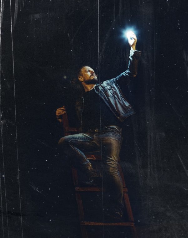
It’s not perfect – a bit “scratchy,” the jean jacket reads modern, and the ladder leans up against maybe a wall? Which would look weird here. So let’s drop it in, crop the lamplighter, remove the scratchiness in the image, and fix the color tone to make it read less “Levis.” Oh, and change the “glow” color to gold (everyone knows luthiel burns golden) and shift his hands ahd face color back from sickly green (see his right hand below) to a healthy, rosy skin tone:

Next, we need to add those back ladder legs and brace in so the whole thing doesn’t come crashing down:

And last but not least, how about a cool lens flare to bring it all together? I know, I know, many cover designers abhor the lens flare. But I think it still has a place, when used just right:

And there you go… the finished cover. I love this kind of work, but it does take me a long time. Still, no one else will have this cover, so in the end it’s all worth it!
If you want to try the book, you can grab it on Amazon for just 99¢!
