Universal Buy Link
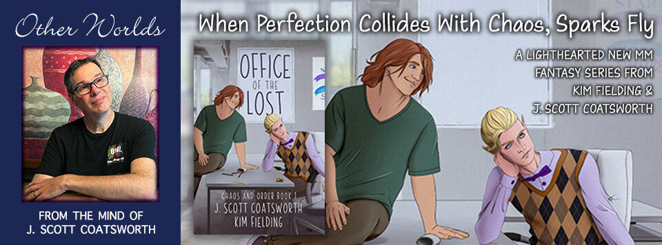
Every time I do a new book, there’s a whole behind-the-scenes process that goes into designing the cover, whether it’s one I do myself or one done by a graphics professional.
In this case, we decided to go with an outside designer, and there were two clients to please – Kim and I. We started with a cover search in the gay romantasy genre, and found a few we really liked:
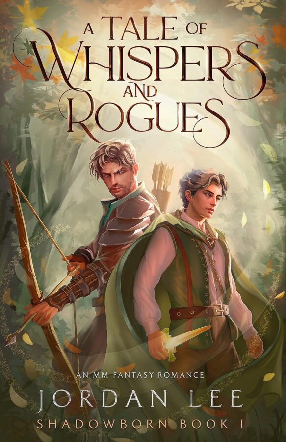
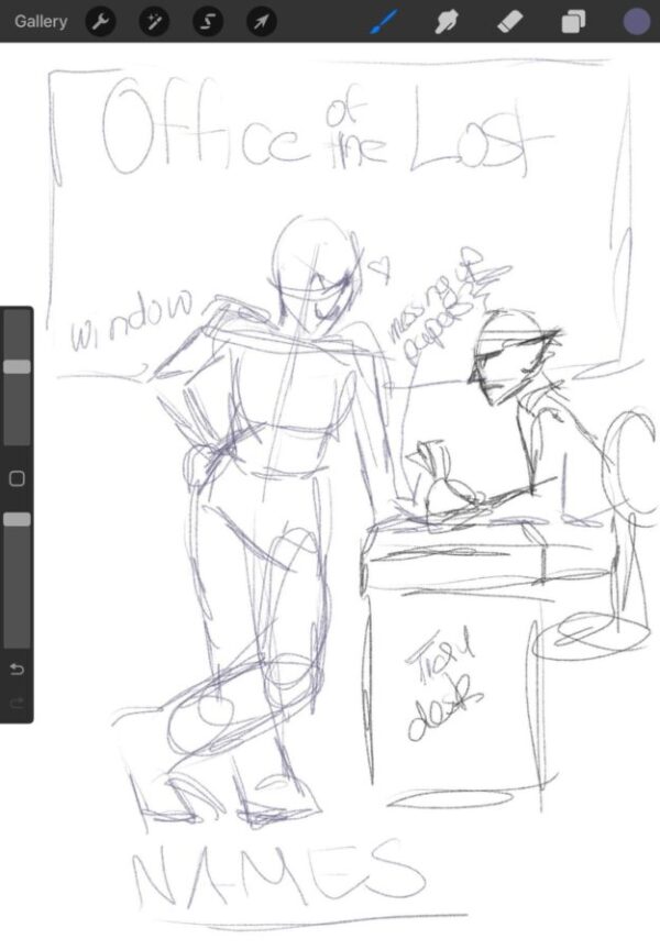
For some reason, we were both really drawn to the “comic book-cartoon” images. We asked Kelley York at Sleepy Fox Studio to take a run at it. She returned with a basic sketch set in the “office” of the title:
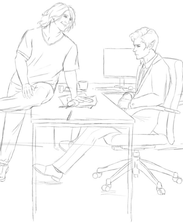
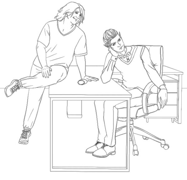
We loved the idea immediately, but it needed… um… some fleshing out. So she went to work again, and the characters sprang to life, showcasing Leopold’s carefree chaos and Crispin’s clinging to order:
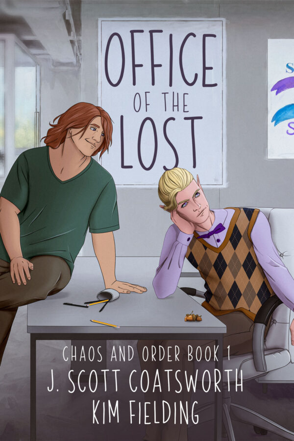
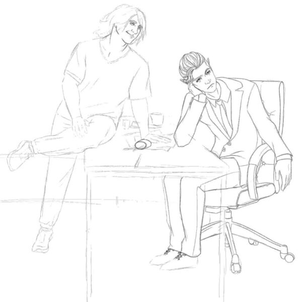
A few changes were in order, though. First up, let’s lose the computer screen. Crispin doesn’t have one. And I wanted him to look more “rolling-eyes-annoyed” than perturbed. So I sent her an image similar to this one (the original is one I don’t have the rights to post, but you get the idea):

and she adjusted Crispin’s pose and expression beautifully:
One little tweak (oh how Kelley hates me now – “why didn’t you tell me this sooner?”) – Crispin is more of an argyle vest kinda guy than a suit. And the details are starting to solidify:
Now, how about a little (base) color?

Looking good. Time for Kelley to layer in the detail color and show us what the cover itself might look like:
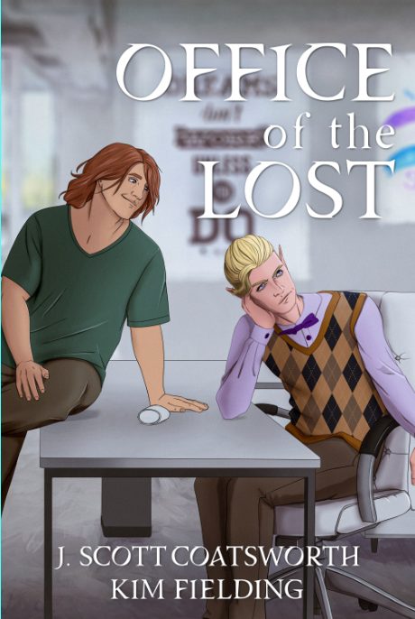
Almost there. But not thrilled about the font. Maybe something more playful? How about [SPOILER ALERT] a pile of acorns on the corner of the desk? And where are the spilled pencils? She came up with a brilliant solution for the title:

It’s perfect, in every possible way except… (you can hear Kelley’s sharp inhale of breath) maybe go back to the suit? Kidding! But make the title font a bit darker, please.
And there you go:
I just want to reiterate that it’s such an amazing thing to work through a process like this with a real human artist, and not to ask an AI app to spit out something based on a prompt. There’s a real joy to it, and there’s meaning behind the art, as you can see above. Every choice was made for a reason, and reinforces the message and plot of the book.
This is what human-created art – whether it’s words, graphics, or voice – is all about. Support your human artists.
Preorder now (6/21 release):