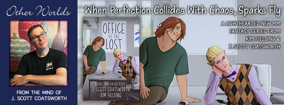
Hey all! I’m releasing a new short story – “Chinatown” – next Tuesday, and thought it would be fun to take you on a behind-the-scenes tour of how I made the cover.
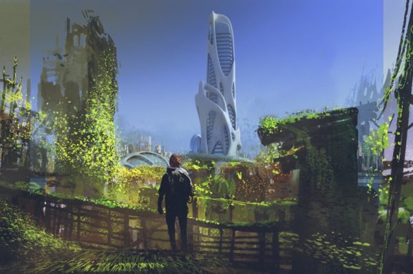
I started with a search for the right images. The story takes place in a future version of San Francisco, where Chinatown is the newest part of the city, run by Chinese invaders, and the rest of the city is in ruins.
So I was looking for something dystopian. it took about an hour nosing through sci fi images on Deposit Photos, but eventually I found this image:
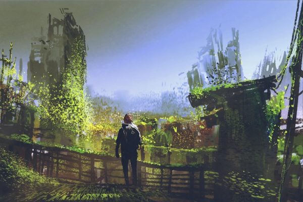
It worked perfectly (well, with just a little tweaking to the story) for the opening scene, except for one minor detail – the lack of a suitable “Chinatown” in the distance. So back into Deposit Photos I went. In fairly short order, I found my second image:
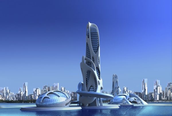
In another half an hour, I had the images combined. You can see at the edges that the first image was a little wider:
I added some text (the older and keen-eyed among you might recognize the font form the late, great Omni Magazine) and had my first rough-cut, albeit not exactly the right proportions:
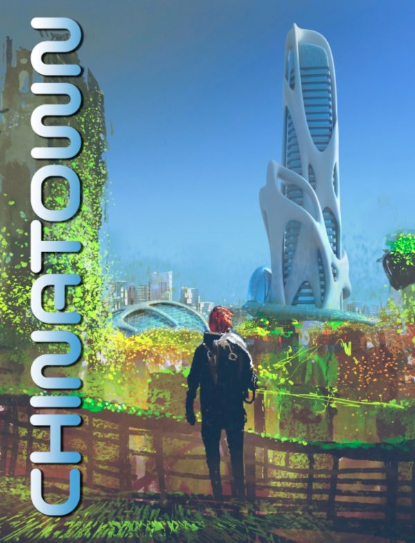
I loved the puzzle the font provided in this orientation, and how it made you think to figure it out. My readers and friends were NOT amused:
“I’m not sure it’s good marketing to have something that takes a puzzle to figure out on a cover, as an essential element like the title.”
“I know the font is hard to read on purpose, but the font and treatment make it frustratingly impossible.”
“Any time I have to tilt my head and try to figure out a title is a nope for me.”
So it was back to the drawing board. LOL… I tweaked the font, changing it as one person suggested to read top-to-bottom, brightened the color and brought the background up to full opacity, and darkened the foreground, reshaping and coloring the head to get rid of the weird “is-it-a-face” issue. I also added the lens flare as a focal point, and set it to the right proportion for an eBook cover:
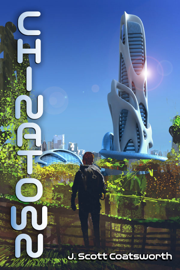
The response was better. People still weren’t 100% sold on the font, especially certain letters:
“I do prefer the letters in the top to bottom order. Funky cover, mate!”
“For me it’s the letter ‘W’. It’s too convoluted. The rest of the letters are okay and readable. If it was more like the “W” in Scott’s author name, then it would be easier to read.”
“I’m still not a fan of the font. The longer I look at it, the letters appear to be crawling along the page like worms.”
But the new head shape and coloring got a cheer:
“yea! Now the head looks like a head!”
And one friend pointed out the dissonance of the two image styles (which suits the dissonance in the story between the two worlds:
“Right now you have two different styles going on. Sketchy abstract concept art, and a clean 3D render. The skyscraper needs atmospheric perspective. Also where is your focal point? They need to look like they fit in the same world together. Best example is if you put Bart Simpson in Disney’s Beauty and the Beast. It doesn’t match and creates discord.”
And they really hated the lens flare:
“Toss out the lens flare filter. It’s the Comic Sans of Photoshop. There are easier and much more accurate ways to do a flare by painting.”
In the end, I took what made sense to me and modified the cover once again. I chose a different, more legible but still sci fi-ish font, added the red-yellow lines to include a reference to historical China, and cleaned up the image a bit more:
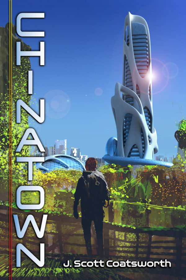
Not everyone loved it. but the response was 95% positive:
“Looks good, very eye-catching. And that font is much easier to read than the wiggly one, cute as it was.”
“BULLSEYE!!! That is exactly what was needed for the title in that orientation, and the font is so much better.”
“Now that I like!”
So score! I just uploaded the story to Amazon for preorder last night. Here’s a little teaser:
Deryn is a dreamcaster in the new Chinese enclave in what was once San Francisco. He and his girlfriend Gracie scrape together a life, living in an old department store and struggling to live by the Charter under Chinese rule. But when someone offers a way out, Deryn is afraid he might lose everything if it goes wrong, including his unborn child. Until he learns that a worse fate awaits them all if he doesn’t act.
You can preorder it here: https://www.amazon.com/dp/B087BH776R/
Hope you enjoyed the journey!